Build a Consistent Visual Reference Board for Your Brand
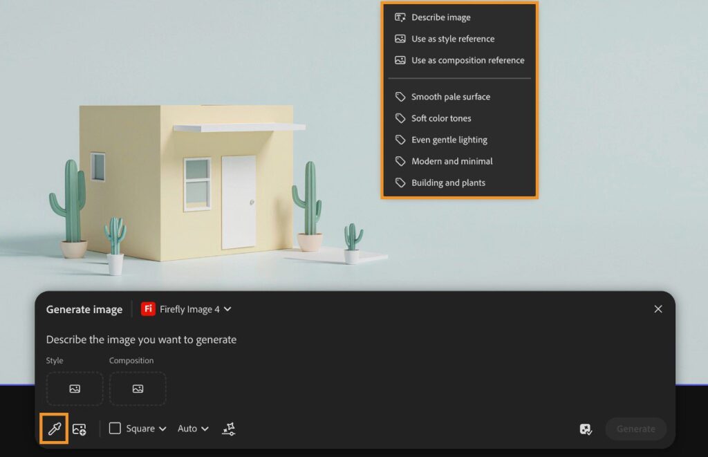
Consistency comes from a few deliberate choices. A reference board should explain what to repeat and what to avoid across posts.
A practical sequence
- Collect your own or properly licensed examples and identify the useful attribute in each: lighting, spacing, framing or colour. Do not treat the whole image as something to reproduce.
- Choose a small palette, a text hierarchy and a few composition rules. Include examples of unsuitable treatments so the boundaries are clear.
- Ask a generative tool for variations within those rules using assets you have permission to upload. Select based on the brand brief rather than novelty alone.
- Save approved assets with usage notes and keep a versioned reference board. Review it when a campaign or audience changes.
An example to adapt
Reference note: use this example for soft side lighting and open space, not for copying its subject, logo or distinctive composition.
Try this on a short sample before producing the full campaign. Keep the original asset and an editable working copy, then review the exported result on the device your audience will use. For an Indian audience, check language, names, numerals and the meaning of any offer with someone who understands the intended context.
What to check before you finish
A reference image may carry rights or confidentiality restrictions. Permission to view it is not automatically permission to upload it into an AI service.
Watch or read the final result as a new viewer. Check whether the overall impression is honest, whether the main information is readable and whether you hold the necessary rights. A tool completing a task is not the same as the finished piece being ready to publish.